
This example uses slide.js to create a photo gallery that also acts as a lightbox. The user can click an image to open and close the set. The user can also hover over the top right corner of an image and click the icon that appears to open an image in fullscreen.


HTML:
    <div id='lightbox'>

        <div id='photo1' class='photo'><
            img src='res/photography/mountains.jpg'>
        </div>

        <div id='photo2' class='photo'><
            img src='res/photography/bridge.jpg'>
        </div>

        <div id='photo3' class='photo'><
            img src='res/photography/lake.jpg'>
        </div>

    </div>
Relevant CSS:
        #lightbox {
            height: 300px;
            width: 1230px;
        }

        .photo {
            height: 300px;
            width: 400px;
        }
Javascript:
        const lightboxSlider = new Slider('#lightbox', {
            direction: 'horizontal',
            clickToOpen: true, // default for lightbox = true
            keepOriginalOrder: true,
            lightbox: true,
            captions: [
                'Mountains, 2020',
                'Bridge, 2020',
                'Lake, 2020'
            ],
            captionPosition: 'right',
            onlyShowCaptionsOnHover: true,
            scaleFactor: 0.8
        });

        lightboxSlider.openSetOnDOMContentLoaded();
This example is similar to the first example, except the set opens and closes diagonally.


HTML:
    <div id='lightbox-diagonal'>

        <div id='photo3' class='photo'><
            img src='res/photography/mountains.jpg'>
        </div>

        <div id='photo4' class='photo'><
            img src='res/photography/bridge.jpg'>
        </div>

        <div id='photo5' class='photo'><
            img src='res/photography/lake.jpg'>
        </div>

    </div>
Relevant CSS:
    #lightbox-diagonal {
        height: 300px;
        width: 700px;
    }

    .photo {
        height: 300px;
        width: 400px;
    }
Javascript:
        const lightboxDiagonalSlider = new Slider('#lightbox-diagonal', {
            direction: 'diagonal',
            degree: 25,
            clickToOpen: true, // default for lightbox = true
            keepOriginalOrder: false, // default
            lightbox: true,
            captions: [
                'Mountains, 2020',
                'Bridge, 2020',
                'Lake, 2020'
            ],
            captionPosition: 'left',
            onlyShowCaptionsOnHover: true,
            scaleFactor: 0.5
        });

        lightboxDiagonalSlider.openSetOnDOMContentLoaded();
Unlike the previous examples, this example opens when the user hovers over the currently selected element instead of clicking on it. When the set is open, each element also performs an animation when the user hovers over it.
HTML:
<div id='products'>
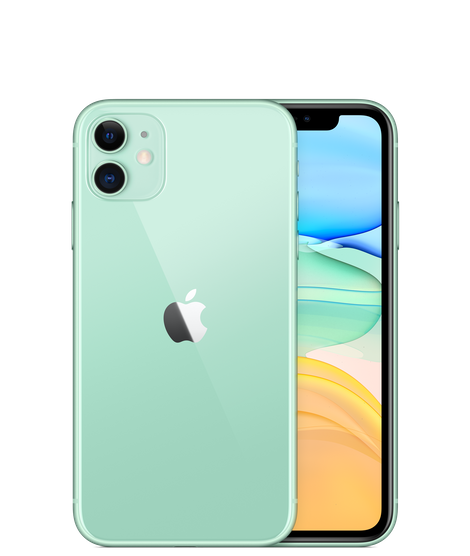
<div id='green-iphone'>
<img src='res/productImages/iphone11-green.png' class='product'>
</div>
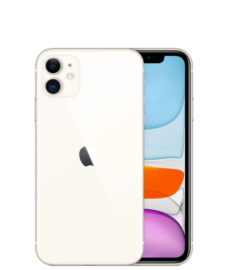
<div id='white-iphone'>
<img src='res/productImages/iphone11-white.png' class='product'>
</div>
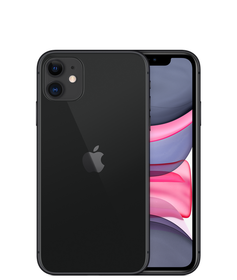
<div id='black-iphone'>
<img src='res/productImages/iphone11-black.png' class='product'>
</div>
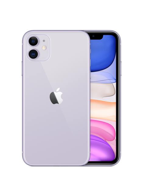
<div id='purple-iphone'>
<img src='res/productImages/iphone11-purple.png' class='product'>
</div>
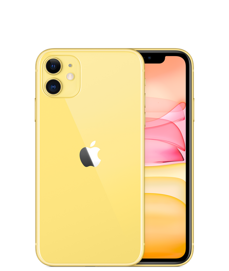
<div id='yellow-iphone'>
<img src='res/productImages/iphone11-yellow.png' class='product'>
</div>
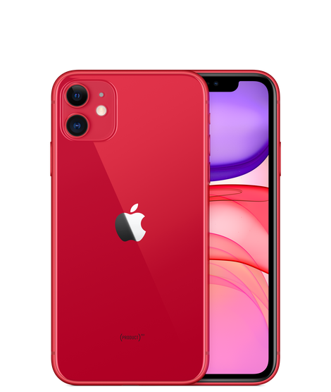
<div id='red-iphone'>
<img src='res/productImages/iphone11-red.png' class='product'>
</div>
</div>
Relevant CSS:
    #products {
        height: 100px;
        width: 600px;
    }

    .product {
        height: 100px;
        width: 100px;
    }
Javascript:
    const productsSlider = new Slider('#products', {
        direction: 'horizontal',
        selectedElementPosition: 'left',
        clickToOpen: false, // default
        keepOriginalOrder: true,
        captions: [
            'Green',
            "White",
            "Black",
            "Purple",
            "Yellow",
            "Red"
        ],
        captionPosition: 'center', // default
        hoverAnimation: true
    });

    productsSlider.openSetOnDOMContentLoaded();
This example uses slide.js to create an animated version of Twitter's sidebar menu.


HTML:
    <div id='dropdown-menu'>

        <div class='menu-option' id='home'>
            <img src='res/menuIcons/home-24px.svg' class='menu-icon'>
            <div class='menu-option-text'>Home</div>
        </div>

        <div class='menu-option' id='explore'>
            <img src='res/menuIcons/explore-24px.svg' class='menu-icon'>
            <div class='menu-option-text'>Explore</div>
        </div>

        <div class='menu-option' id='notifications'>
            <img src='res/menuIcons/notifications-24px.svg' class='menu-icon'>
            <div class='menu-option-text'>Notifications</div>
        </div>

        <div class='menu-option' id='messages'>
            <img src='res/menuIcons/email-24px.svg' class='menu-icon'>
            <div class='menu-option-text'>Messages</div>
        </div>

        <div class='menu-option' id='bookmarks'>
            <img src='res/menuIcons/bookmark_border-24px.svg' class='menu-icon'>
            <div class='menu-option-text'>Bookmarks</div>
        </div>

        <div class='menu-option' id='lists'>
            <img src='res/menuIcons/format_list_bulleted-24px.svg' class='menu-icon'>
            <div class='menu-option-text'>Lists</div>
        </div>

        <div class='menu-option' id='profile'>
            <img src='res/menuIcons/person-24px.svg' class='menu-icon'>
            <div class='menu-option-text'>Profile</div>
        </div>

        <div class='menu-option' id='more'>
            <img src='res/menuIcons/more_horiz-24px.svg' class='menu-icon'>
            <div class='menu-option-text'>More</div>
        </div>

    </div>
Relevant CSS:
    #dropdown-menu {
        width: 150px;
        height: 320px;
    }

    .menu-option {
        width: 150px;
        height: 40px;
    }
Javascript:
    const dropdownSlider = new Slider('#dropdown-menu', {
        direction: 'vertical',
        selectedElementPosition: 'top',
        keepOriginalOrder: true,
        clickToOpen: true
    });

    dropdownSlider.openSetOnDOMContentLoaded();